Challenge
Modern life erodes both health and motivation, making movement feel optional instead of essential. The challenge was to create an identity that inspires consistency, represents energy in motion, and communicates not only wellness, but a lasting lifestyle of vitality.
Solution
We designed a visual language that embodies momentum and transformation.
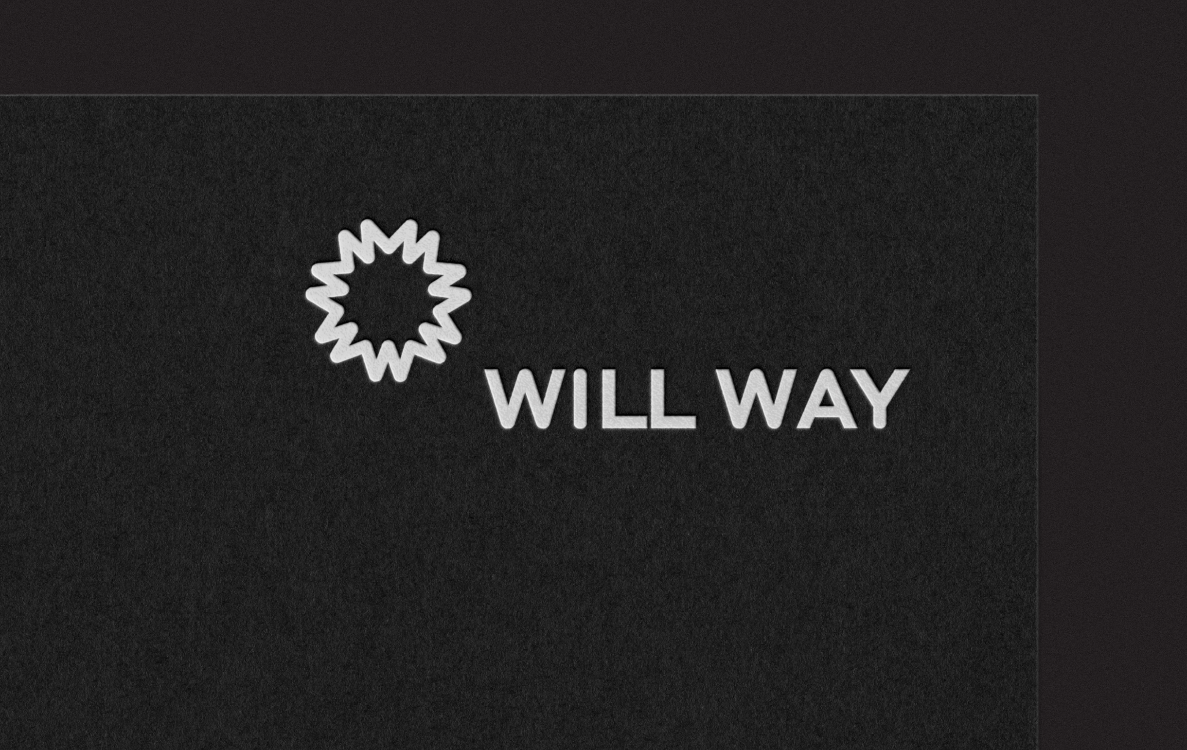
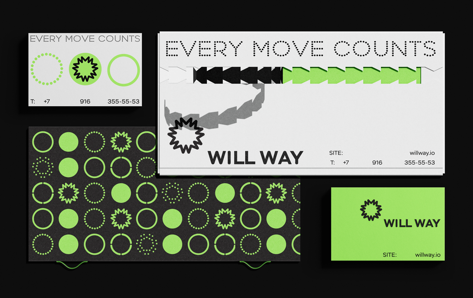
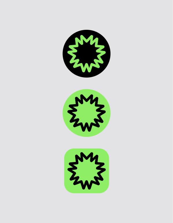
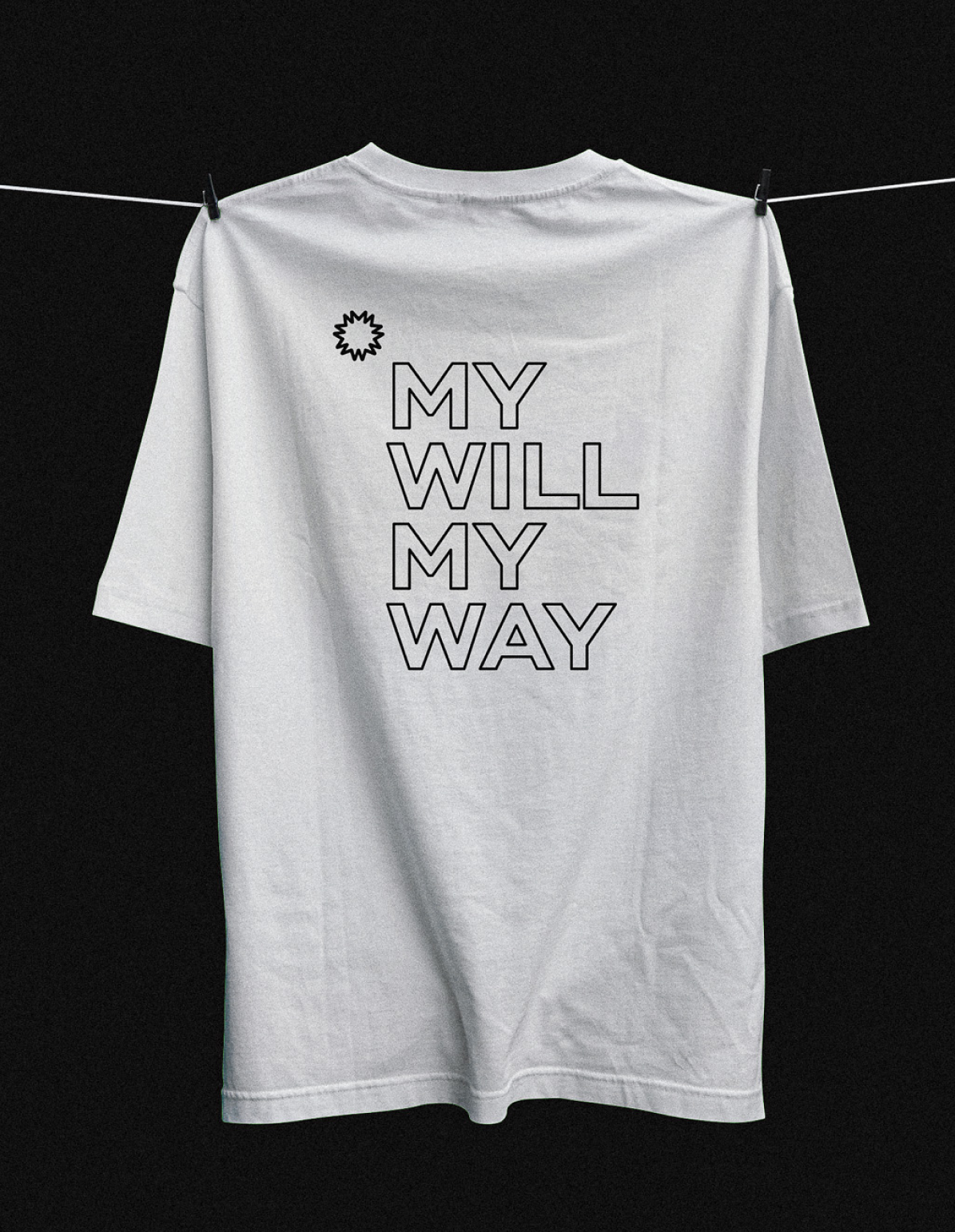
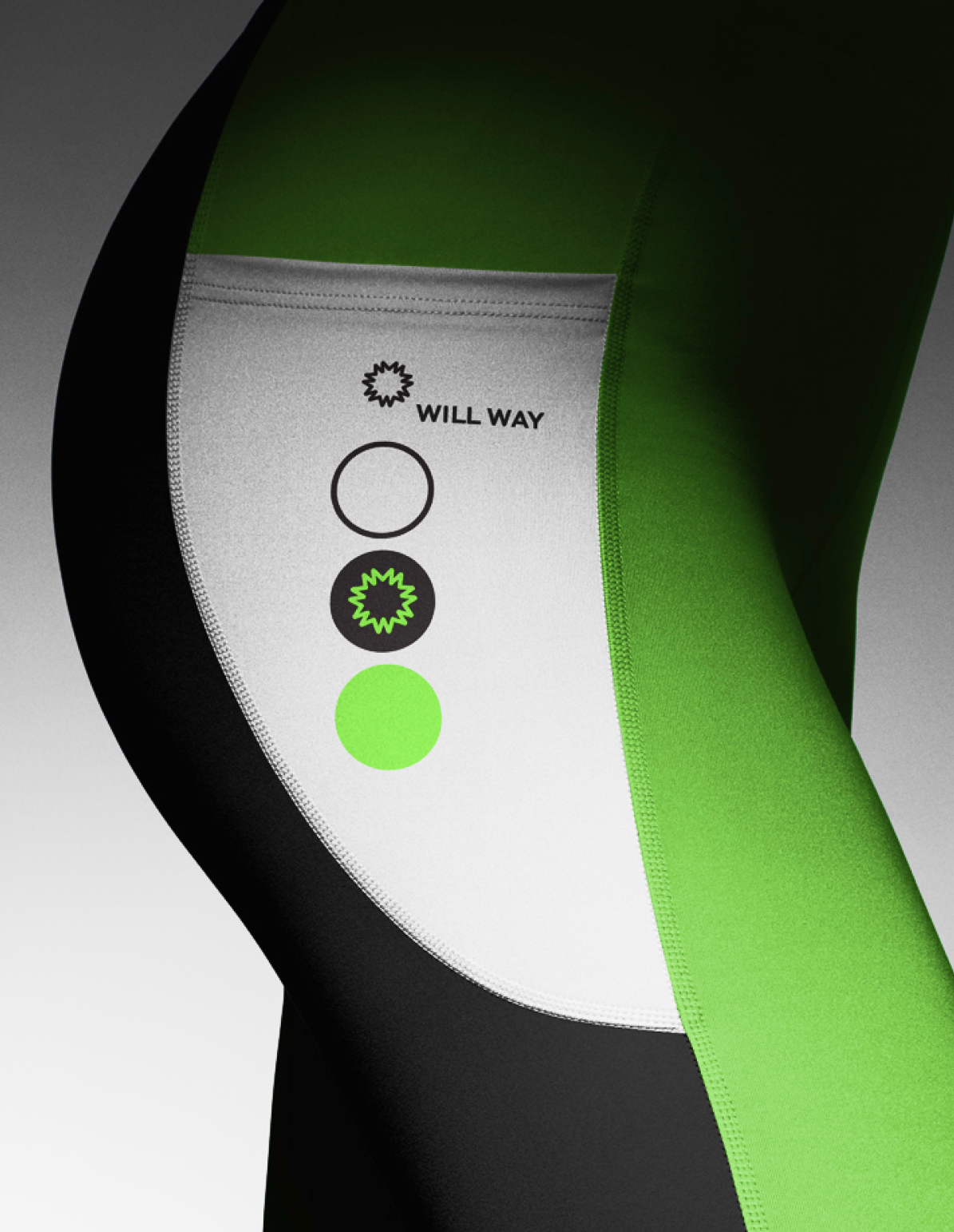
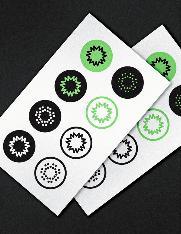
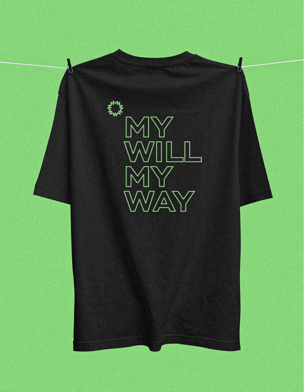
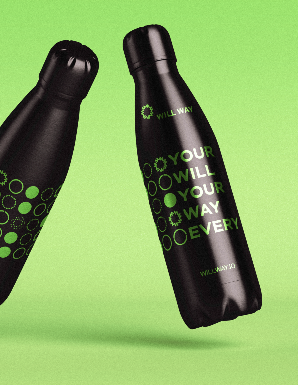
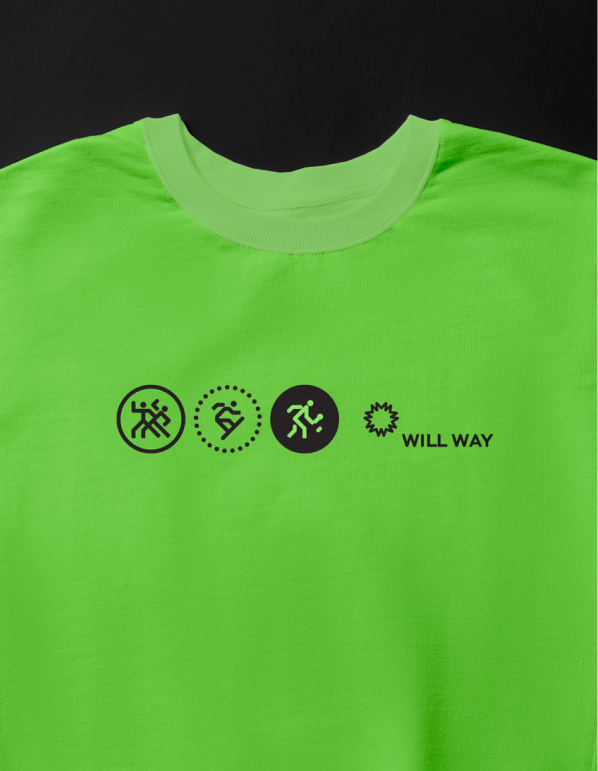
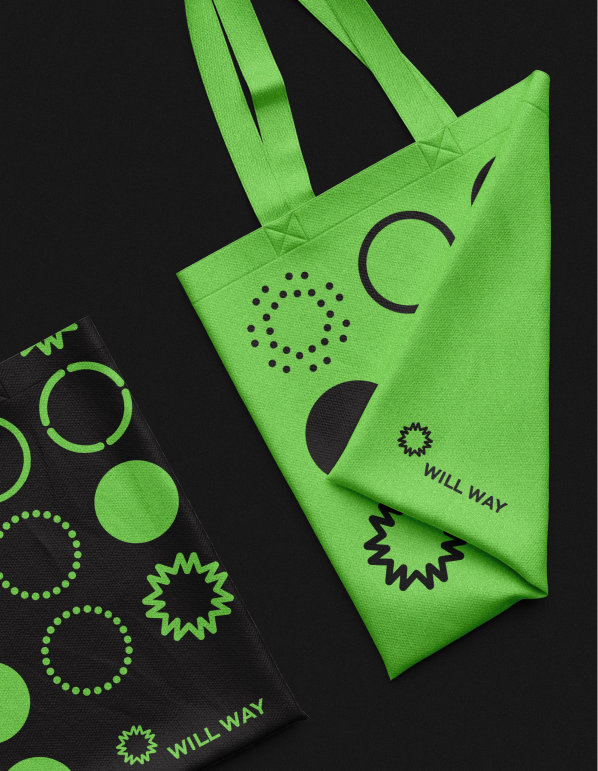
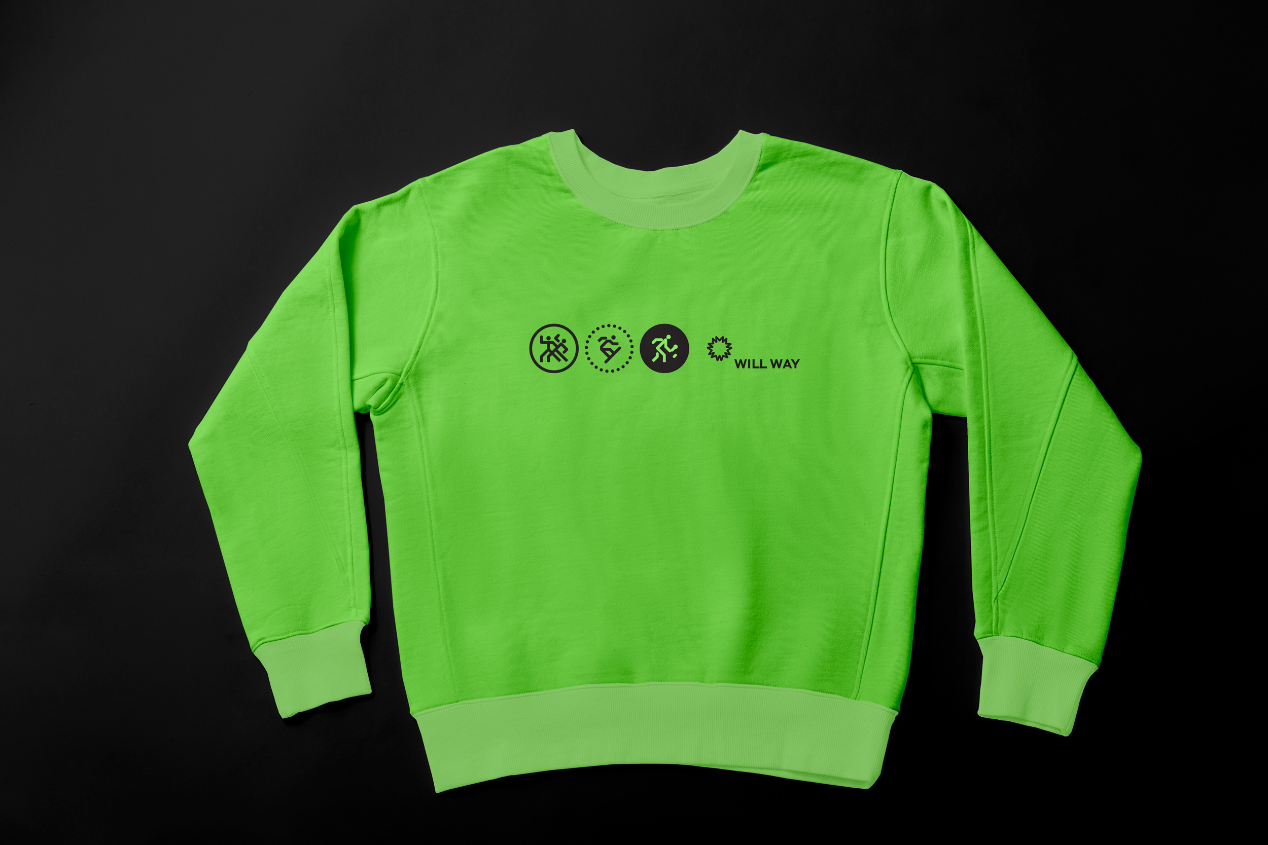
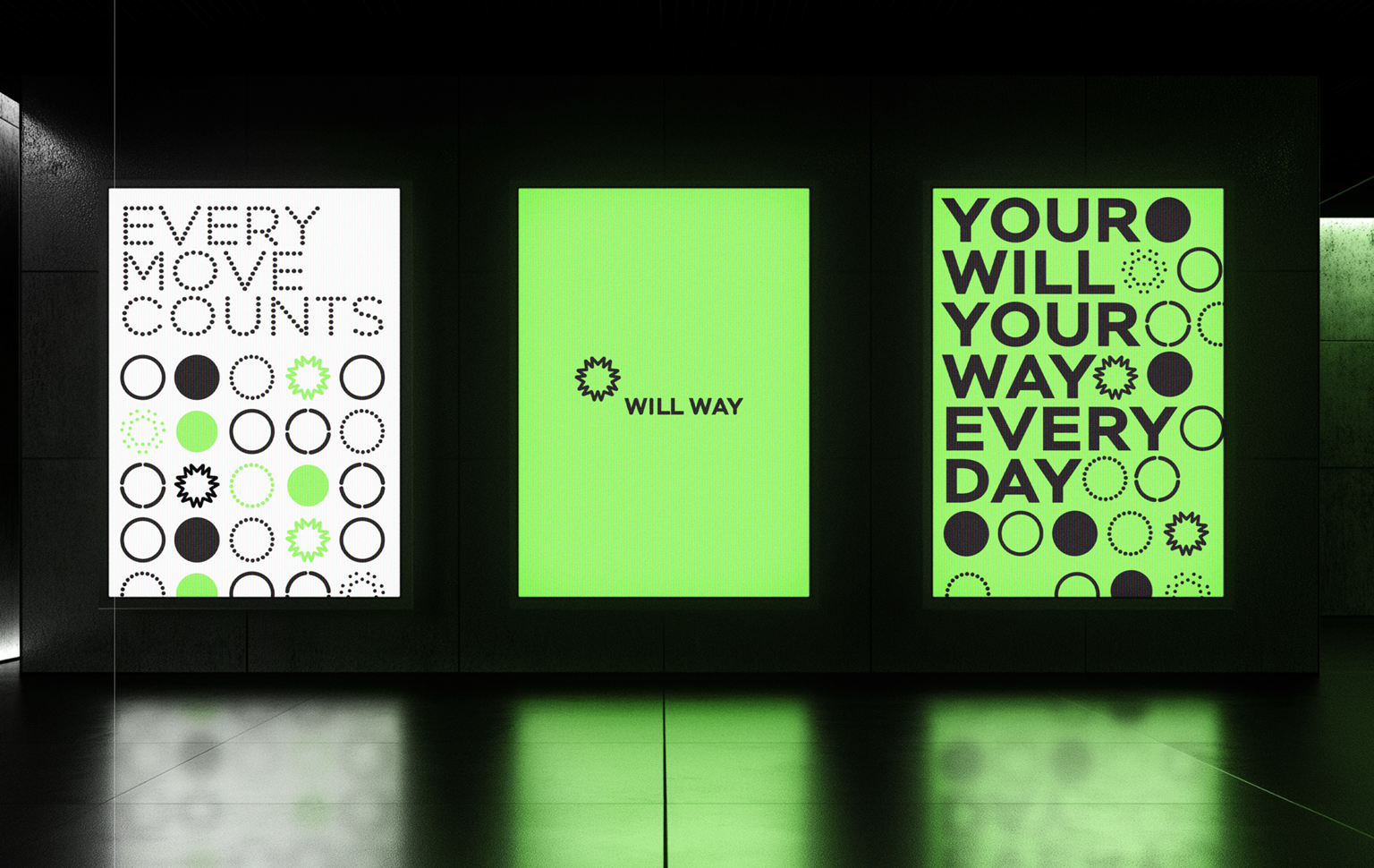
At its core is the Willway star — a symbol of life in motion. Built from multiple points, it reflects community and the diverse paths each user can take. The star seamlessly transforms into dynamic patterns, capturing the flow of energy and constant growth.
A vibrant gradient palette of green, blue, and violet conveys vitality and longevity, while clean, modern typography ensures clarity and confidence. This flexible system allows Willway to scale across digital and physical touchpoints, uniting product and community under one strong, recognizable identity.
Result
Willway left the project with a cohesive identity system for a wellness and longevity platform built around movement, motivation, and personal rhythm.
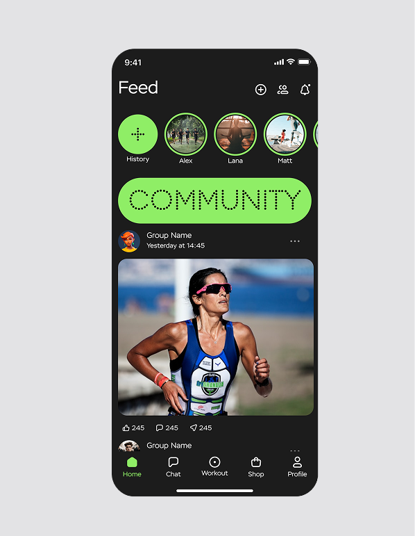
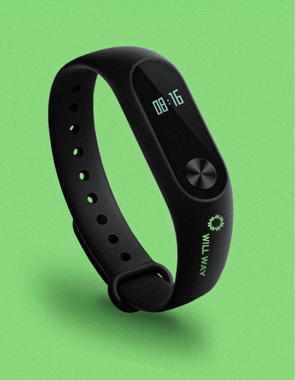
The brand identity gives the app a scalable visual foundation across digital and physical touchpoints, with a symbol, colour system, typography, and interface direction that all support the idea of life in motion.
What changed:
• The brand moved from a fitness app concept into a fuller lifestyle and longevity identity.
• The visual system now communicates motion, vitality, community, and personal growth.
• The Willway star became a flexible brand symbol for movement, transformation, and shared paths.
• The identity can scale across app design, digital touchpoints, community materials, and brand merchandise.
• The brand gained a clearer foundation for launch, expansion, and future product communication.

.svg)


.webp)


.svg)