.svg)


(Follow us)
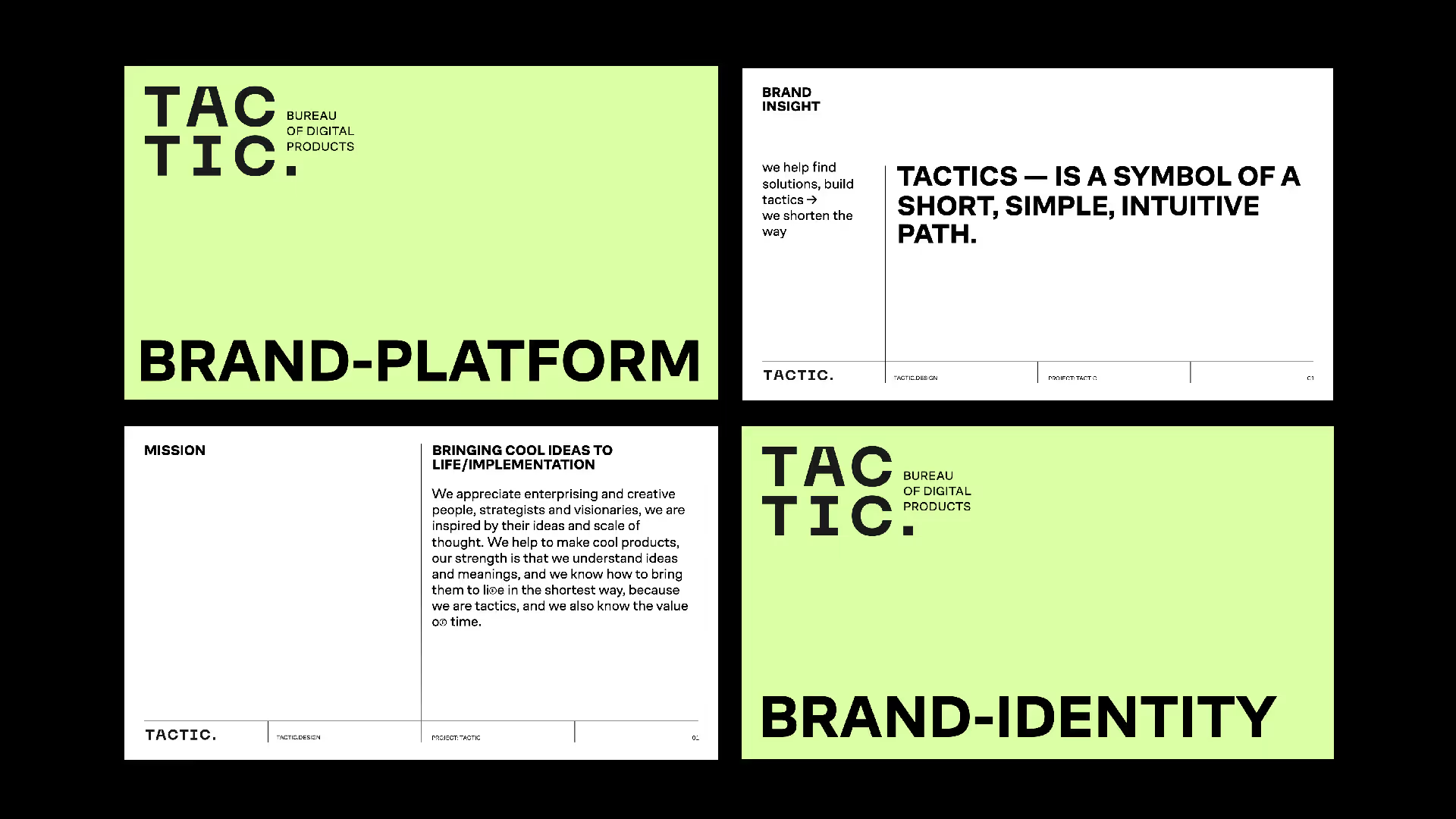
The studio was known for execution but lacked a clear positioning. They needed an identity that would separate them from typical “dev shops” and communicate their unique value: turning vision into action through well-crafted tactics.
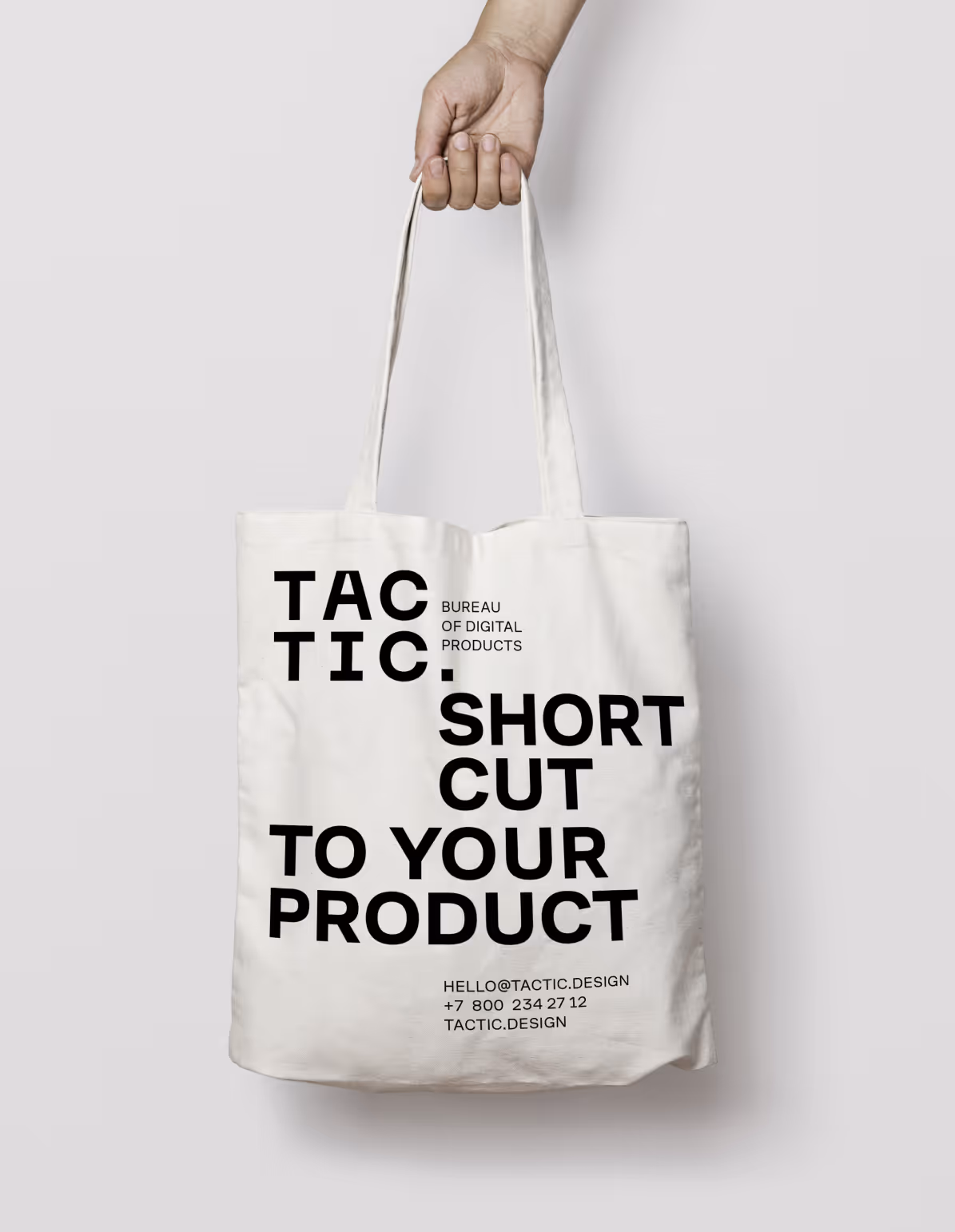
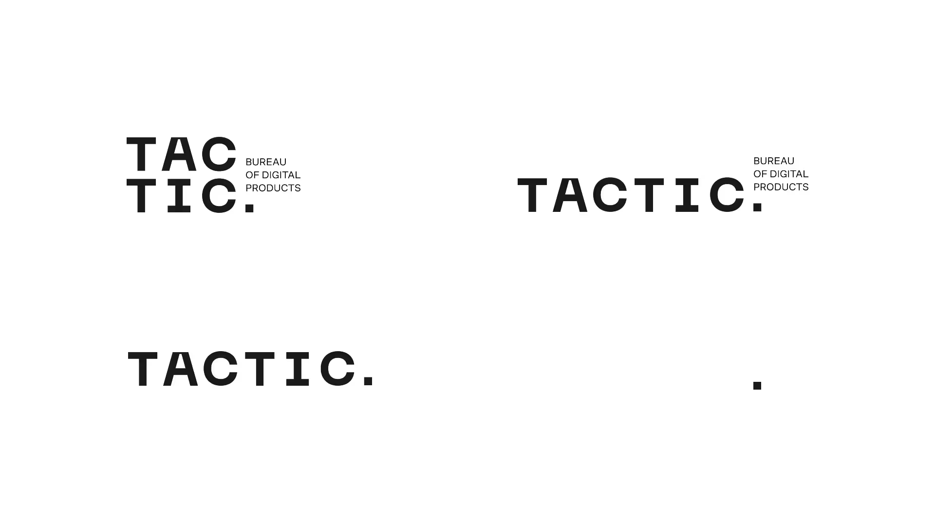
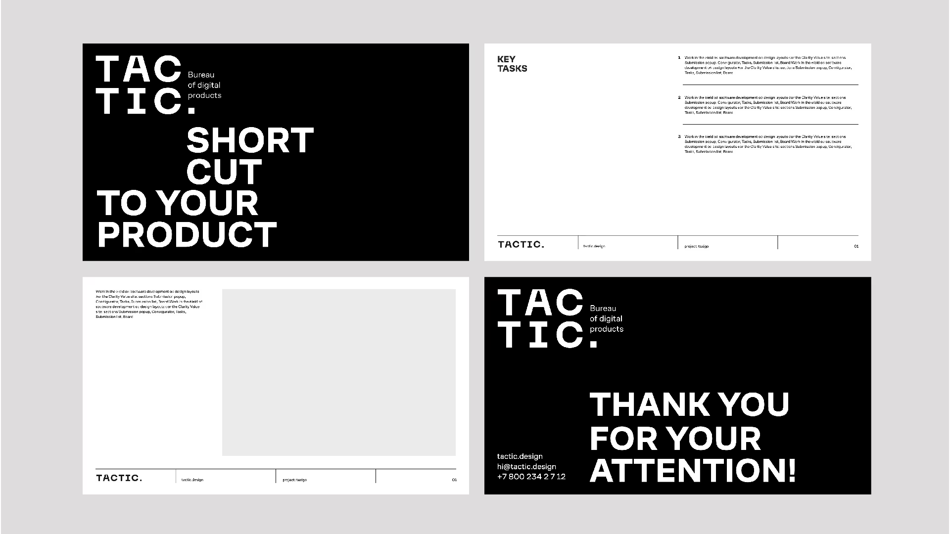
We built a brand platform around a simple idea: Tactics = Shortcut.
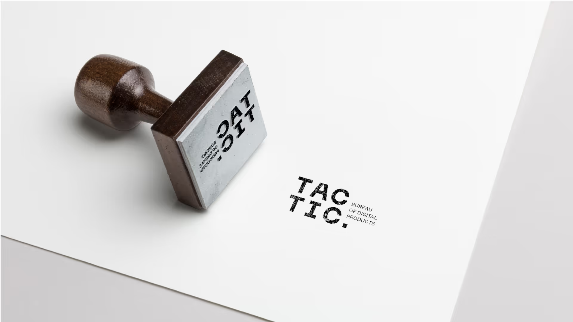
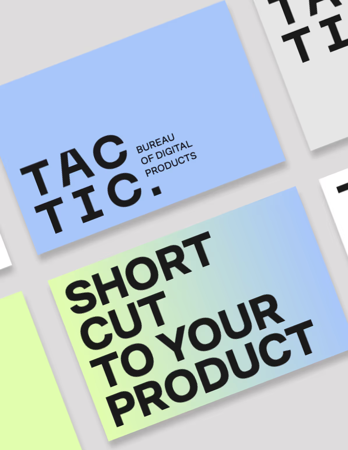
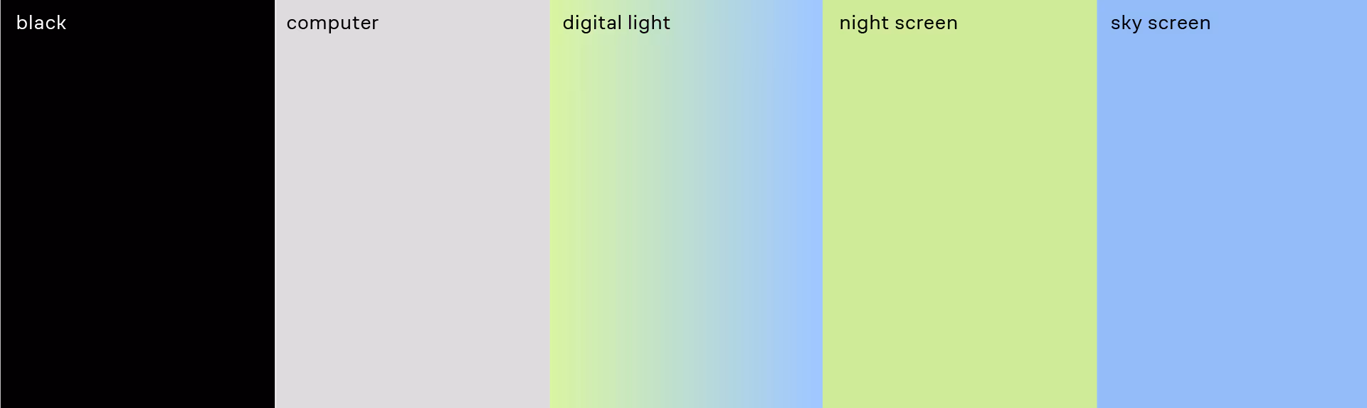
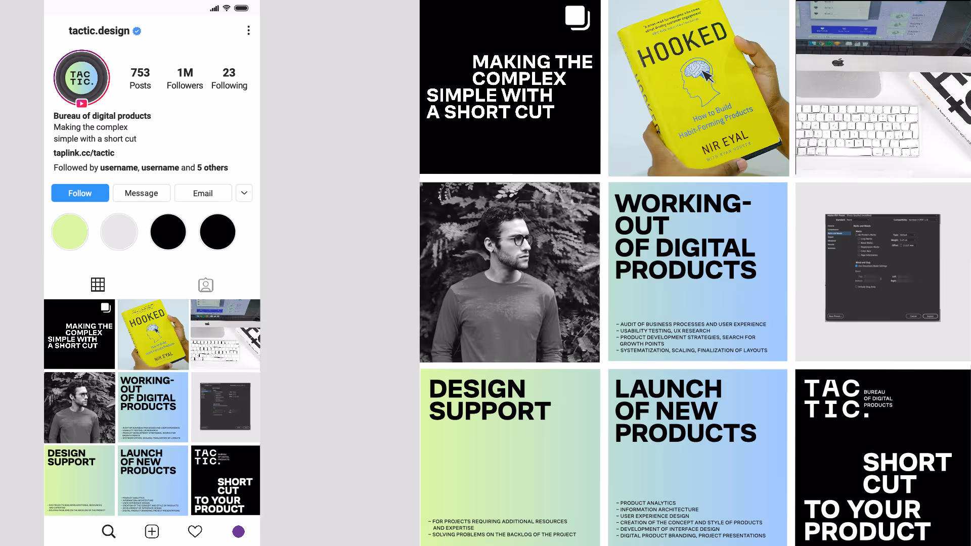
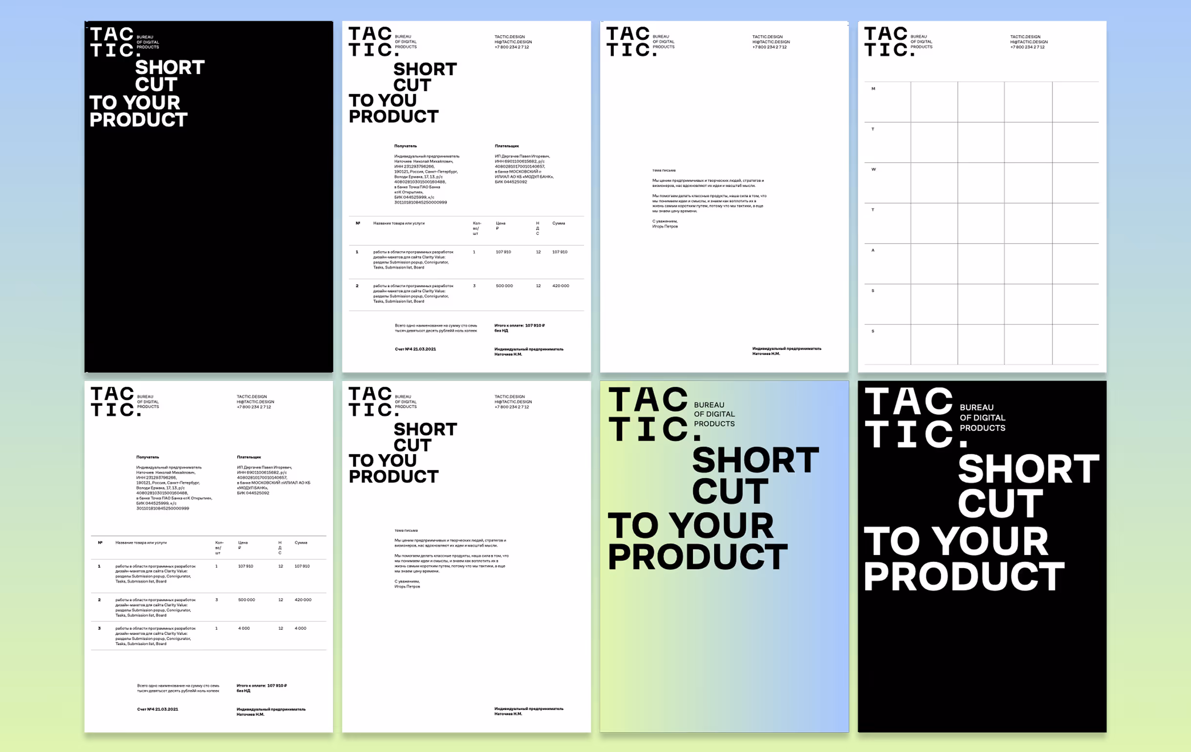
The identity is minimal and functional, echoing the clarity they bring to complex projects. The wordmark splits into blocks — a visual metaphor for steps, structure, and precision. The vibrant green accent represents energy and forward motion, while the grid-based layouts reinforce discipline and clarity.
The tone of voice is direct and pragmatic, highlighting their ability to understand big ideas and translate them into actionable steps.
With the new identity, Tactic is positioned not just as a digital studio, but as a Bureau of Digital Products — the partner who shortens the way from vision to reality. Their brand now reflects both practicality and ambition, making them a trusted counterpart for entrepreneurs and companies seeking clarity and speed.

.svg)