Challenge
The biotech sector is often seen as distant and overly technical. Leeners needed an identity that balanced scientific precision with clarity and trust — helping them stand out to stakeholders while still reflecting the depth of their research and innovation.
Solution
We designed a brand platform rooted in clarity, focus, and transformation.
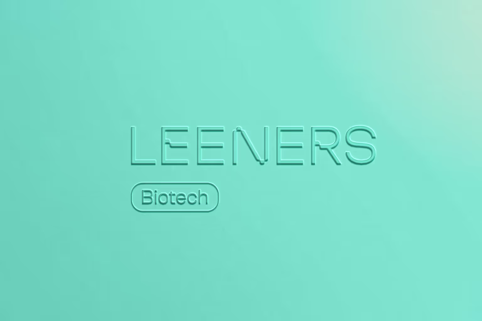
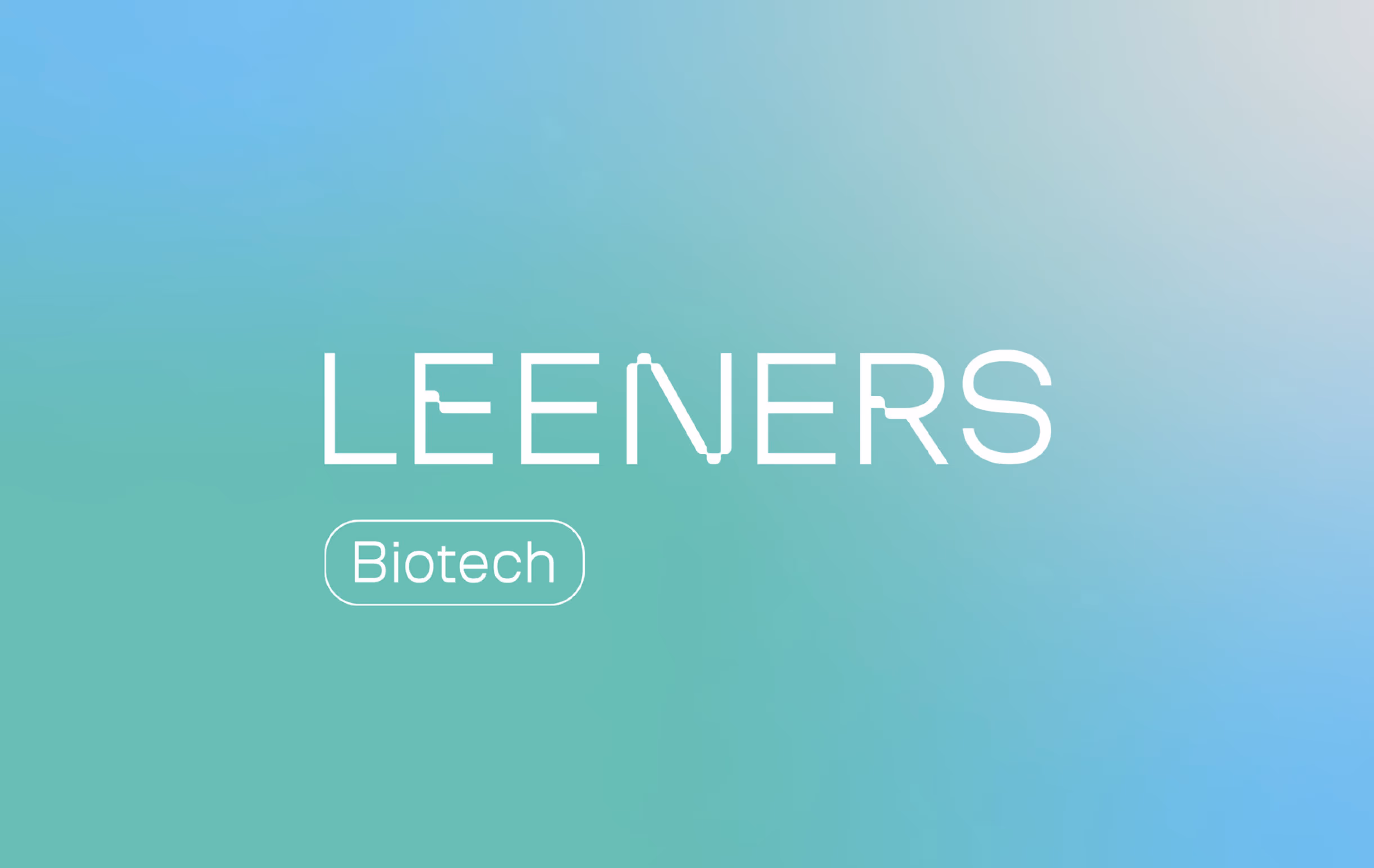
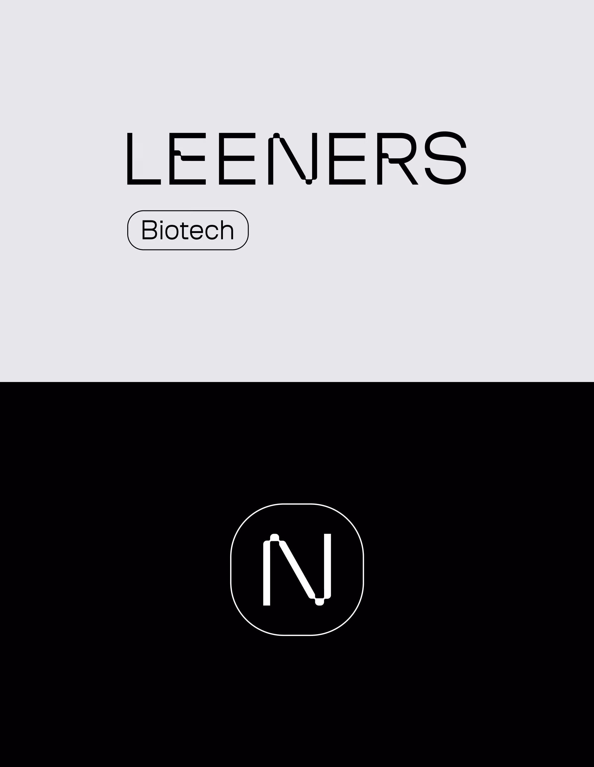
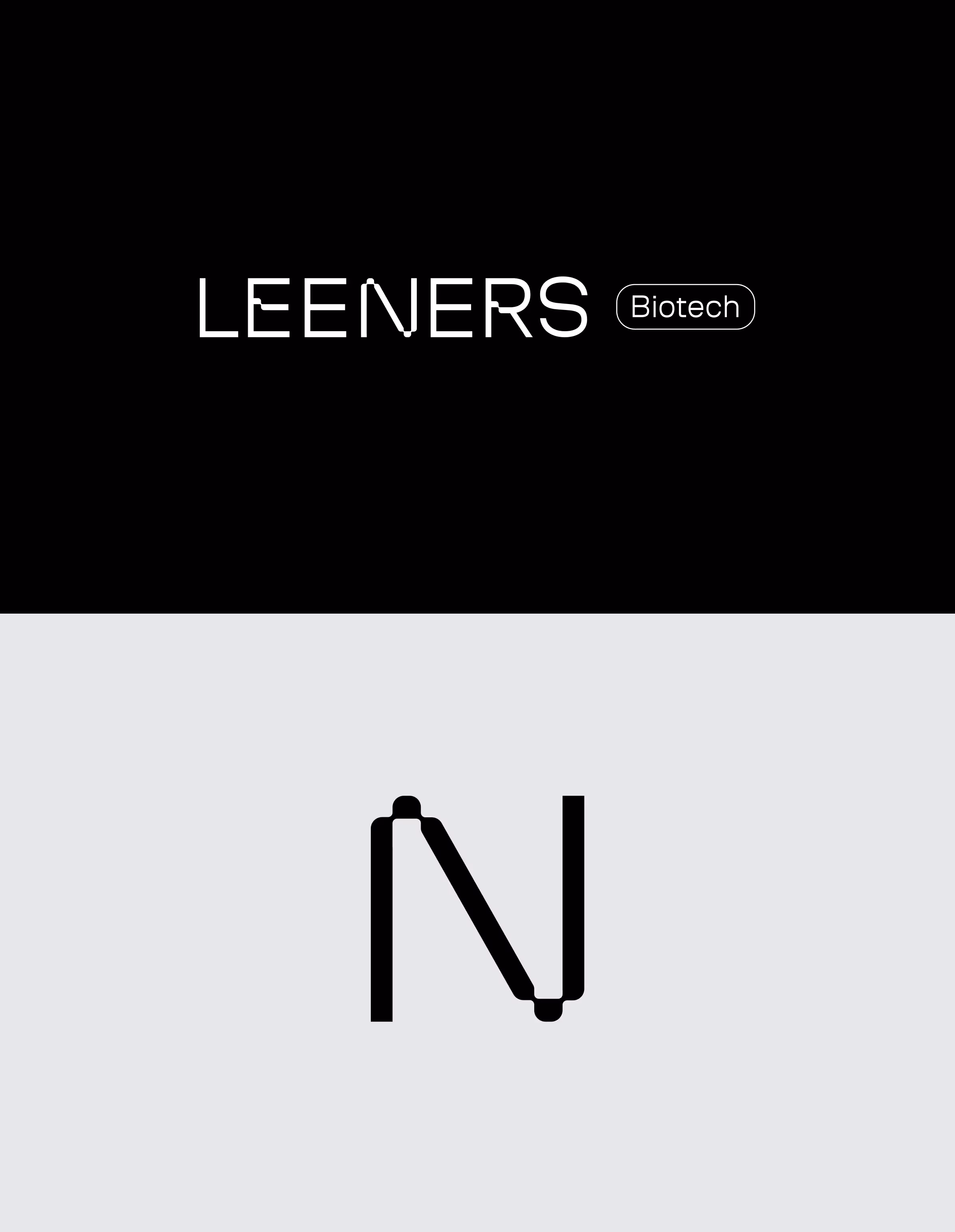
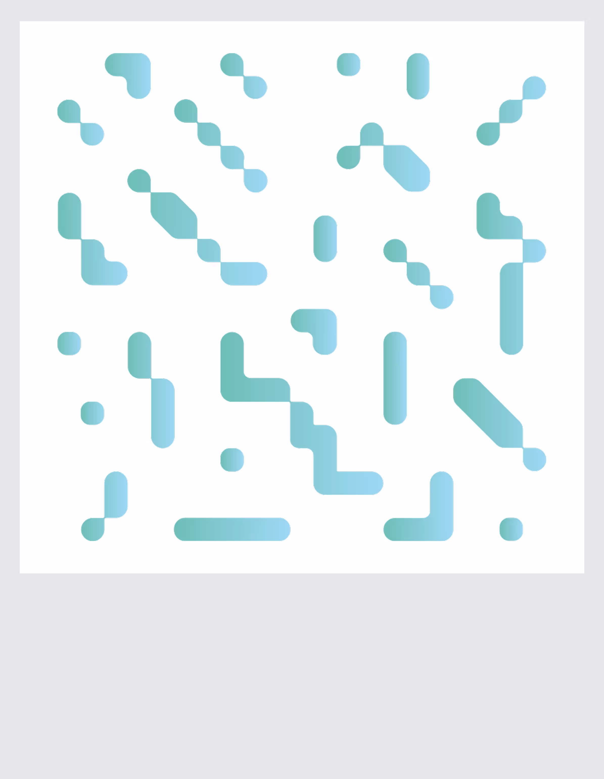
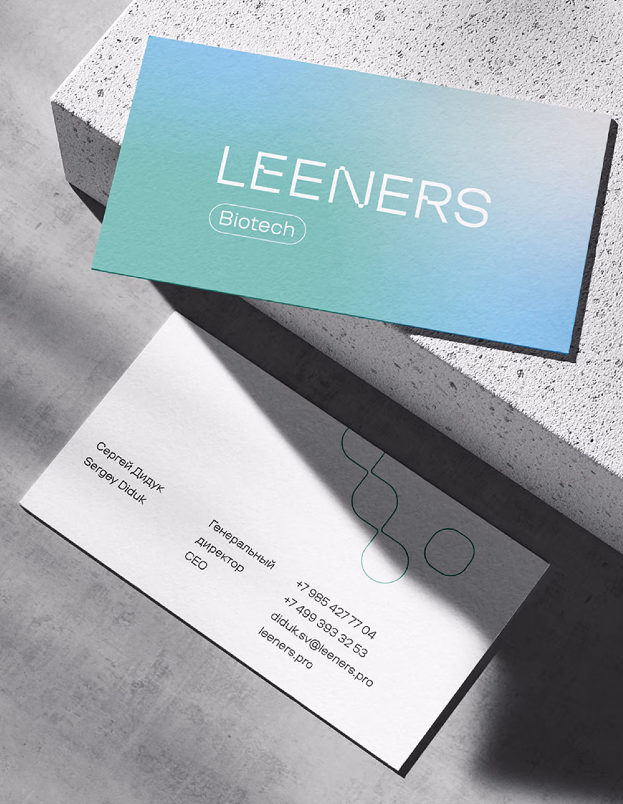
- Visual Identity: A modern logotype with geometric precision paired with a clean graphic system. The design uses gradients and modular patterns as a metaphor for molecular connections and constant progress.
- Tone of Voice: Clear, professional, and confident — avoiding jargon, yet strong enough to communicate scientific expertise.
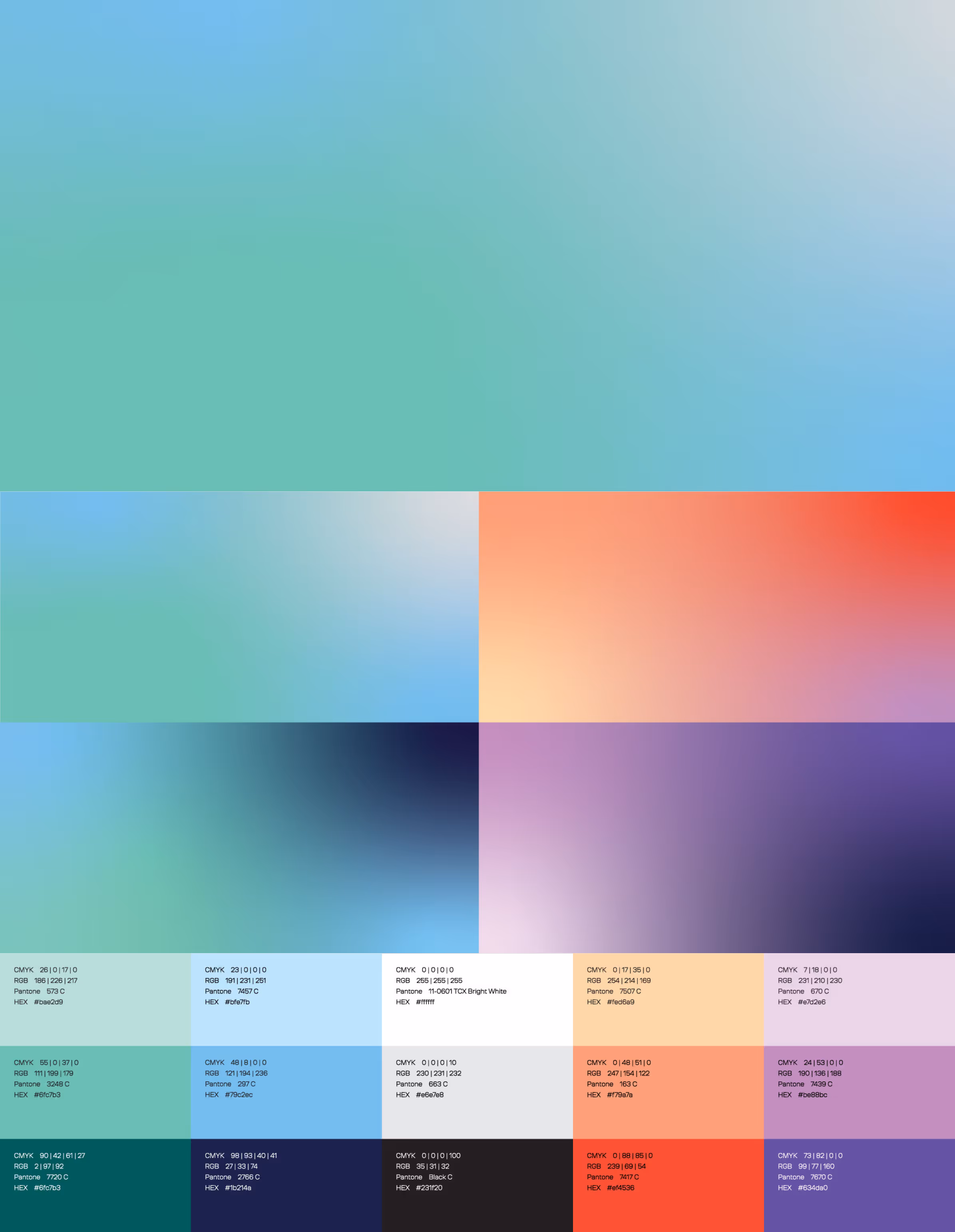
- Color Palette: Cool, future-driven tones (blue, green, white) to evoke trust, health, and forward momentum.
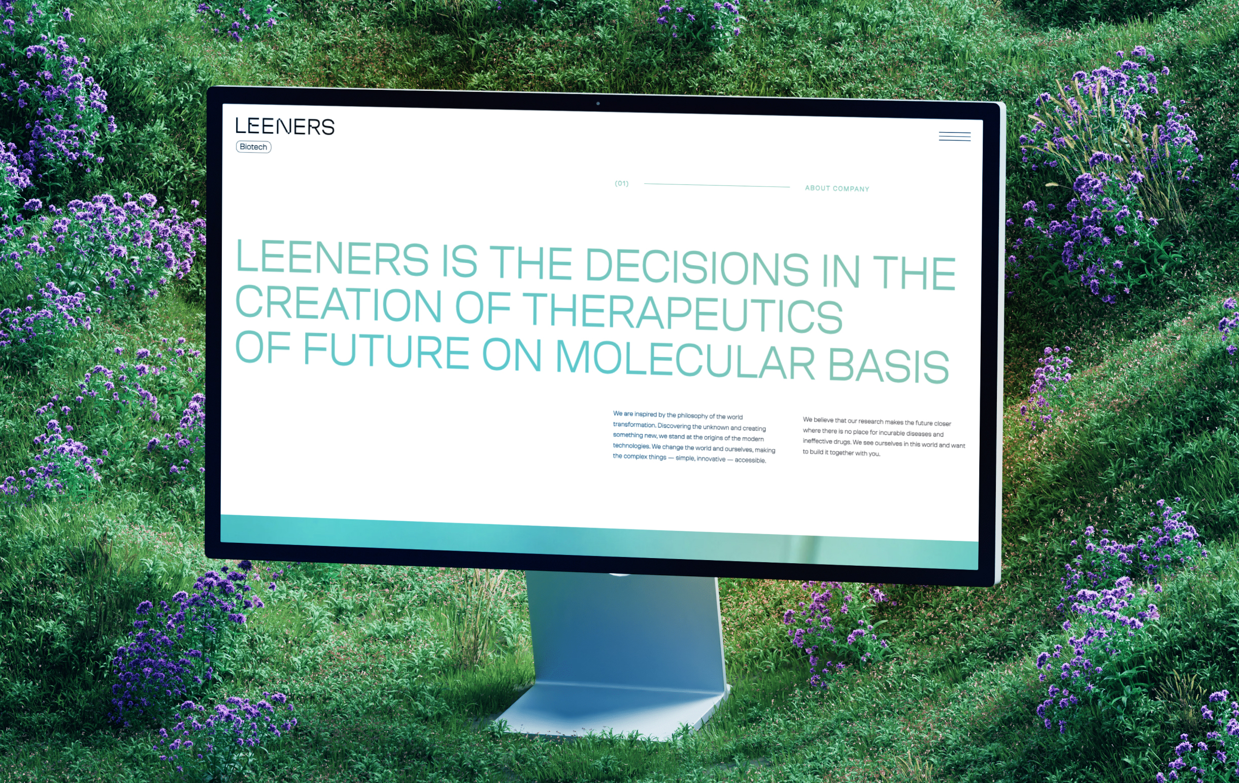
This system ensures Leeners can communicate equally well in scientific presentations, investor decks, and public channels.
Result
Leeners left the project with a clearer biotech brand foundation and a visual identity that could support both scientific credibility and business growth.
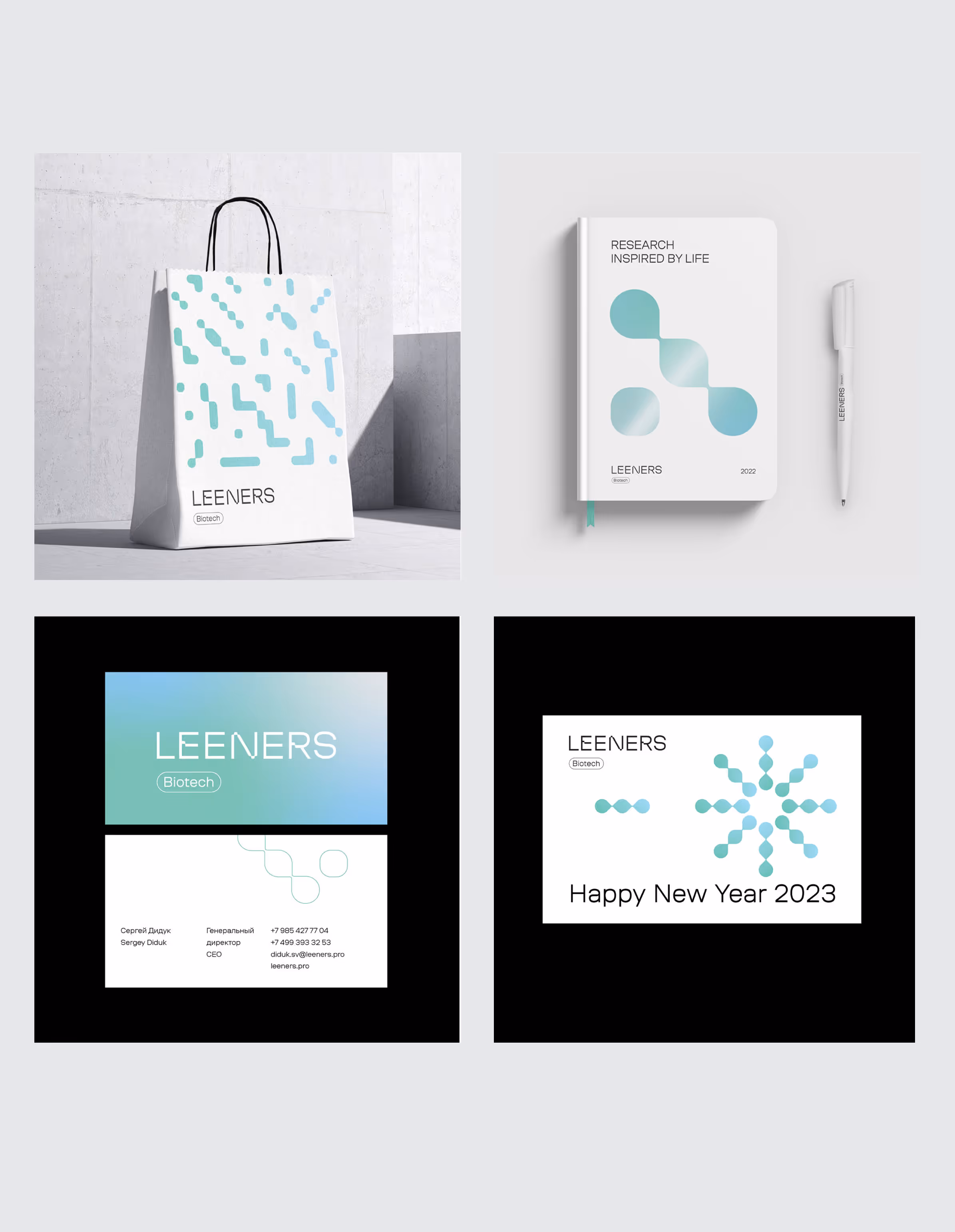
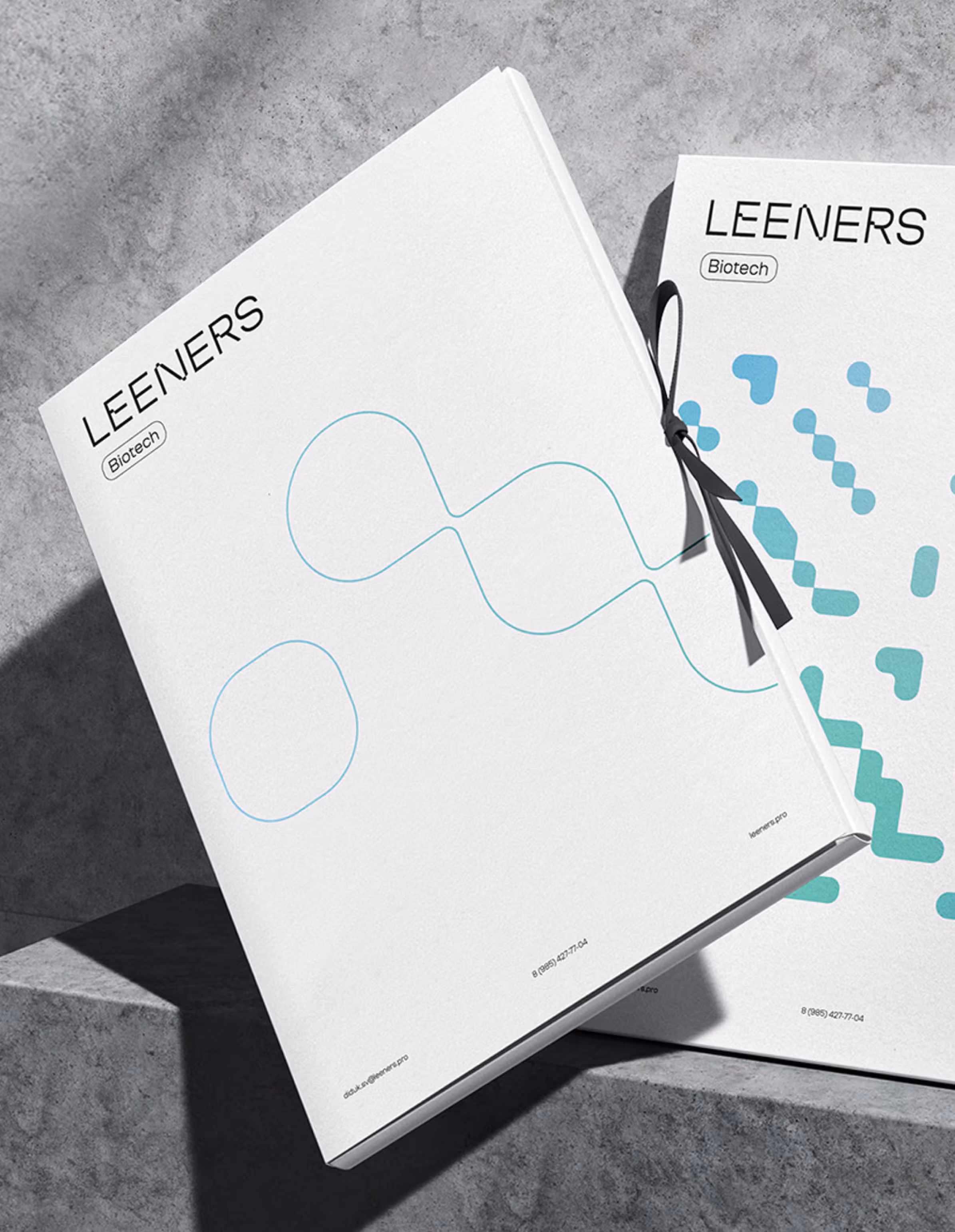
The new system gave the company a more confident way to present itself across the website, presentations, documentation, 3D video materials, and partner-facing communication.
What changed:
• The brand became easier to explain to investors, partners, and non-scientific audiences.
• The identity moved from separate visual directions into one coherent brand system.
• Complex pharmaceutical innovation was translated into clearer language and visual structure.
• The company gained a stronger foundation for presentations, partnerships, and future communication.
• The brand now connects scientific depth with a more distinctive and commercially ready presence.

.svg)


.webp)


.svg)