Challenge
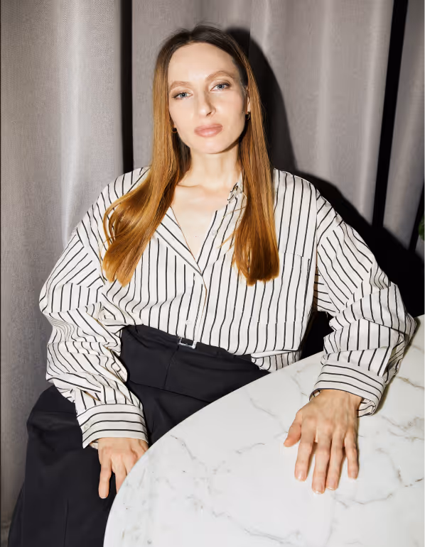
In the competitive beauty industry, personal brands often look alike — glamorous but lacking individuality. Galya Fedotova needed an identity that would highlight both her artistry and her credibility, showing her as a professional who bridges fashion, cinema, and personal beauty.
Solution
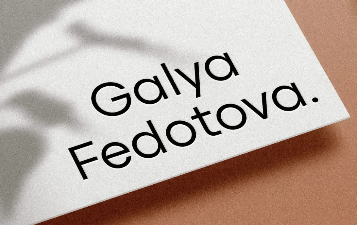
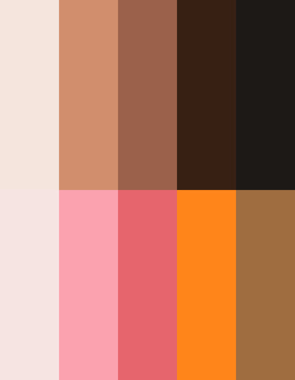
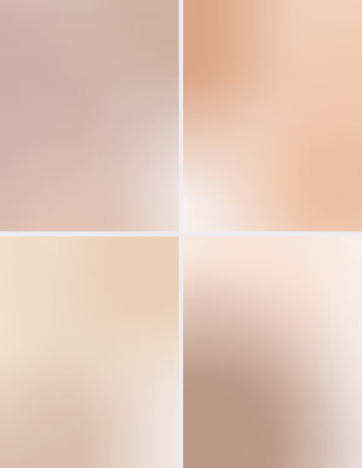
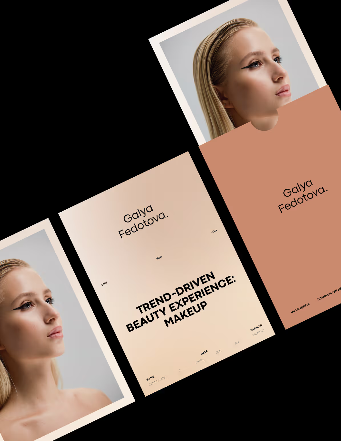
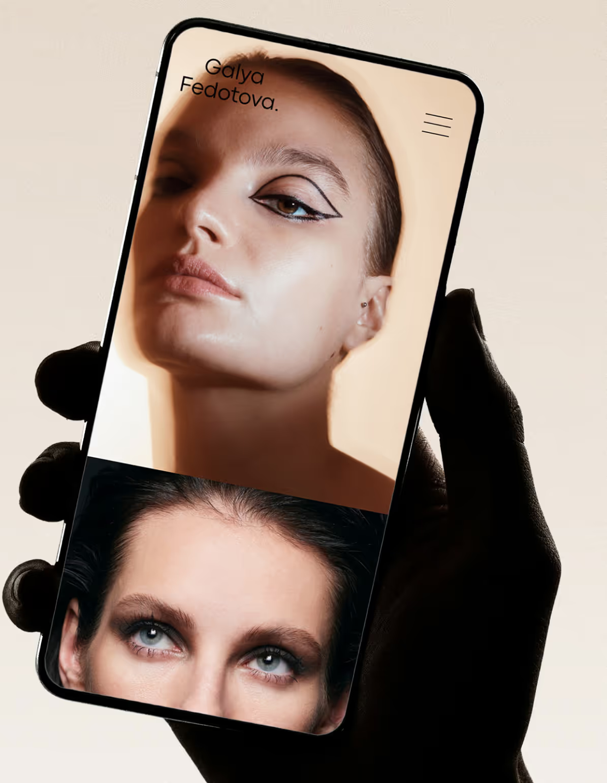
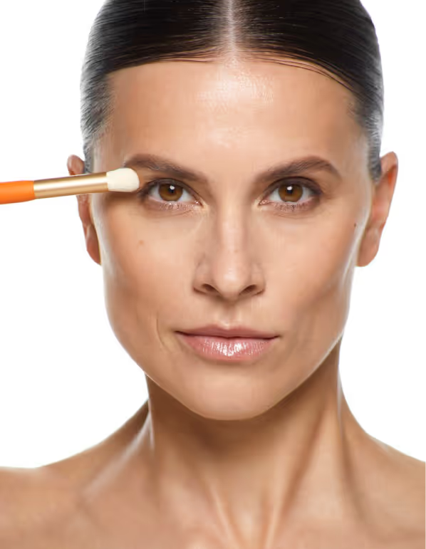
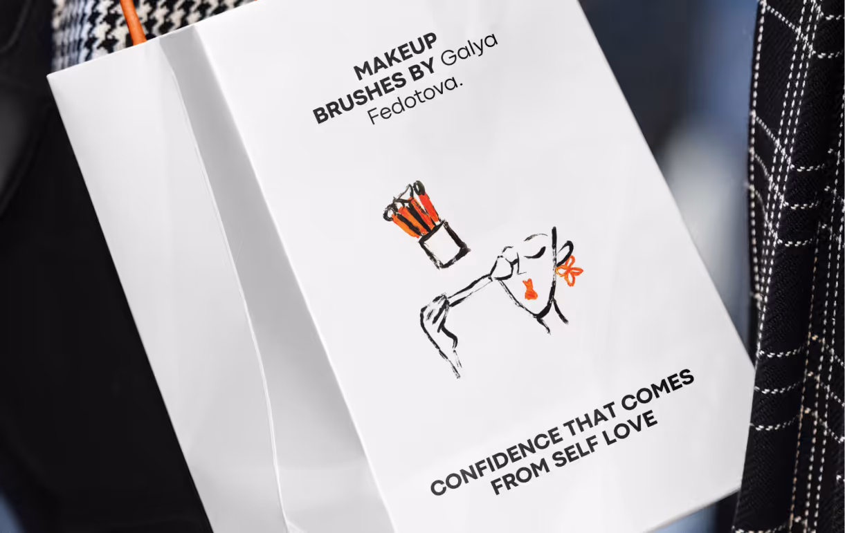
We created a visual identity that reflects Galya’s dual nature: precise technique and creative inspiration. The logo system is clean and minimal, letting her name stand confidently as the central mark. The supporting graphic style uses elegant contrasts and subtle textures, inspired by the tools of her craft — from brush strokes to soft gradients.
Typography is modern and refined, ensuring readability across digital and packaging, while the restrained palette allows her vibrant portfolio of looks to take the spotlight. This balance communicates both trust and artistry.
Result
Galya Fedotova left the project with a personal brand identity that reflects her level of expertise across fashion, cinema, private clients, and future product development.
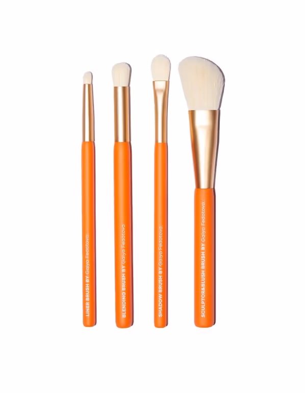
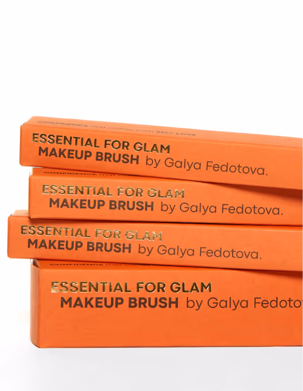
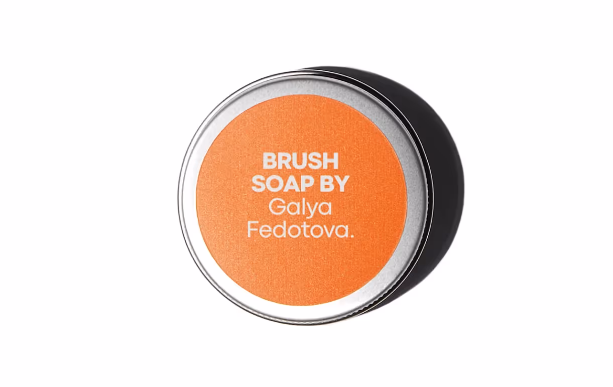
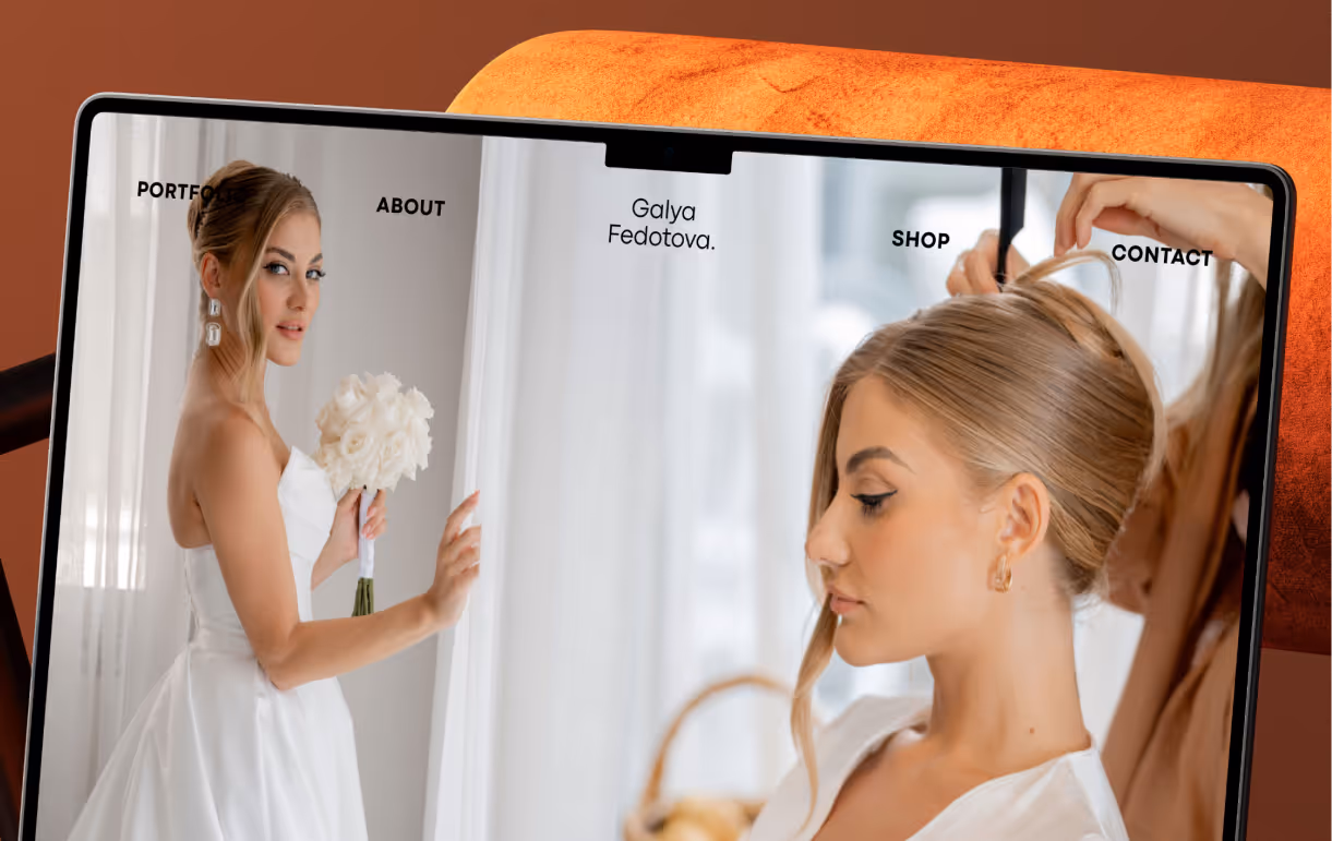
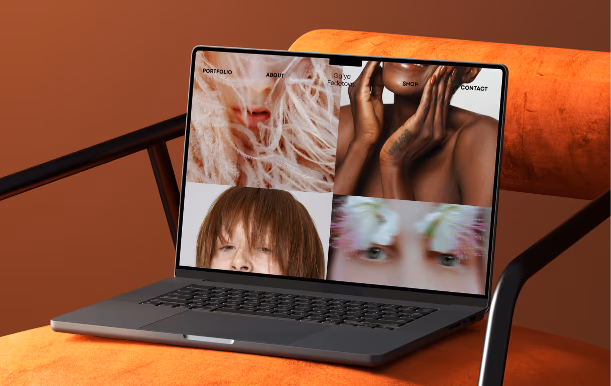
The project connected visual identity, website, printed materials, brand language, and key slogans into one cohesive image. It gave the brand a foundation for the upcoming brush line and beauty hub while keeping Galya’s personal aesthetic at the centre.
What changed:
• The brand moved from personal reputation into a more structured identity for a beauty expert and founder.
• The visual style now reflects Galya’s aesthetic, professional credibility, and creative point of view.
• The website, printed materials, and overall brand concept now work as one cohesive image.
• Brand language and key slogans were refined to express the philosophy behind her work.
• The identity created a foundation for future product lines, beauty content, and brand expansion.

.svg)


.webp)


.svg)