Challenge
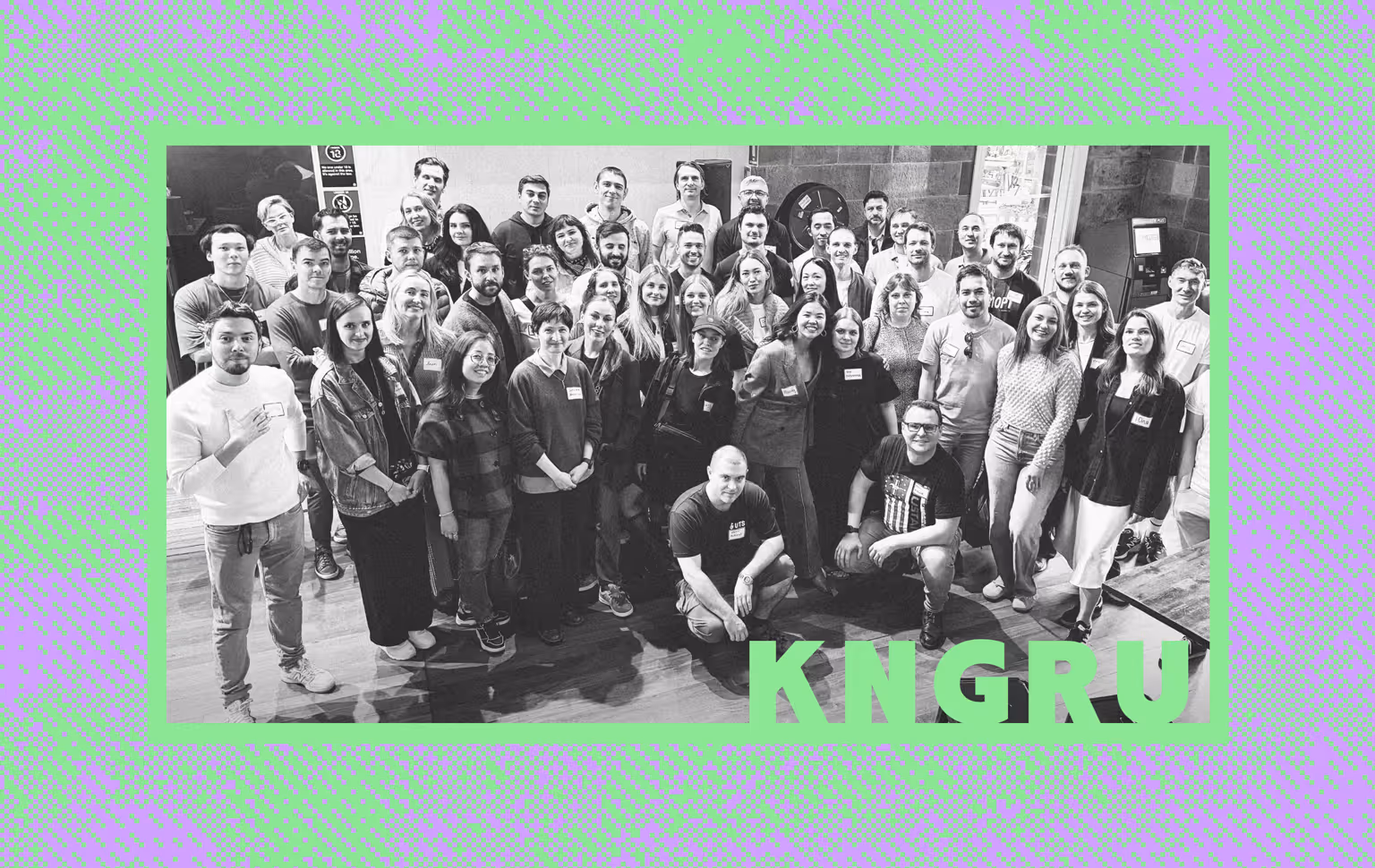
KANGARU began with a meetup in Sydney with Andrey Khusid, founder and CEO of Miro, and 50 people from the Russian-speaking IT and startup ecosystem.
The initiative was growing through many hands: three founders, a strategic advisor, a volunteer working group, and active community members. The challenge was to bring different perspectives under one brand foundation and create an identity the community could recognise as its own.
Input
We worked with the founders, strategic advisor, and volunteer working group while the community was still taking shape.
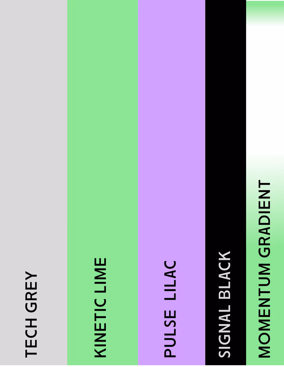
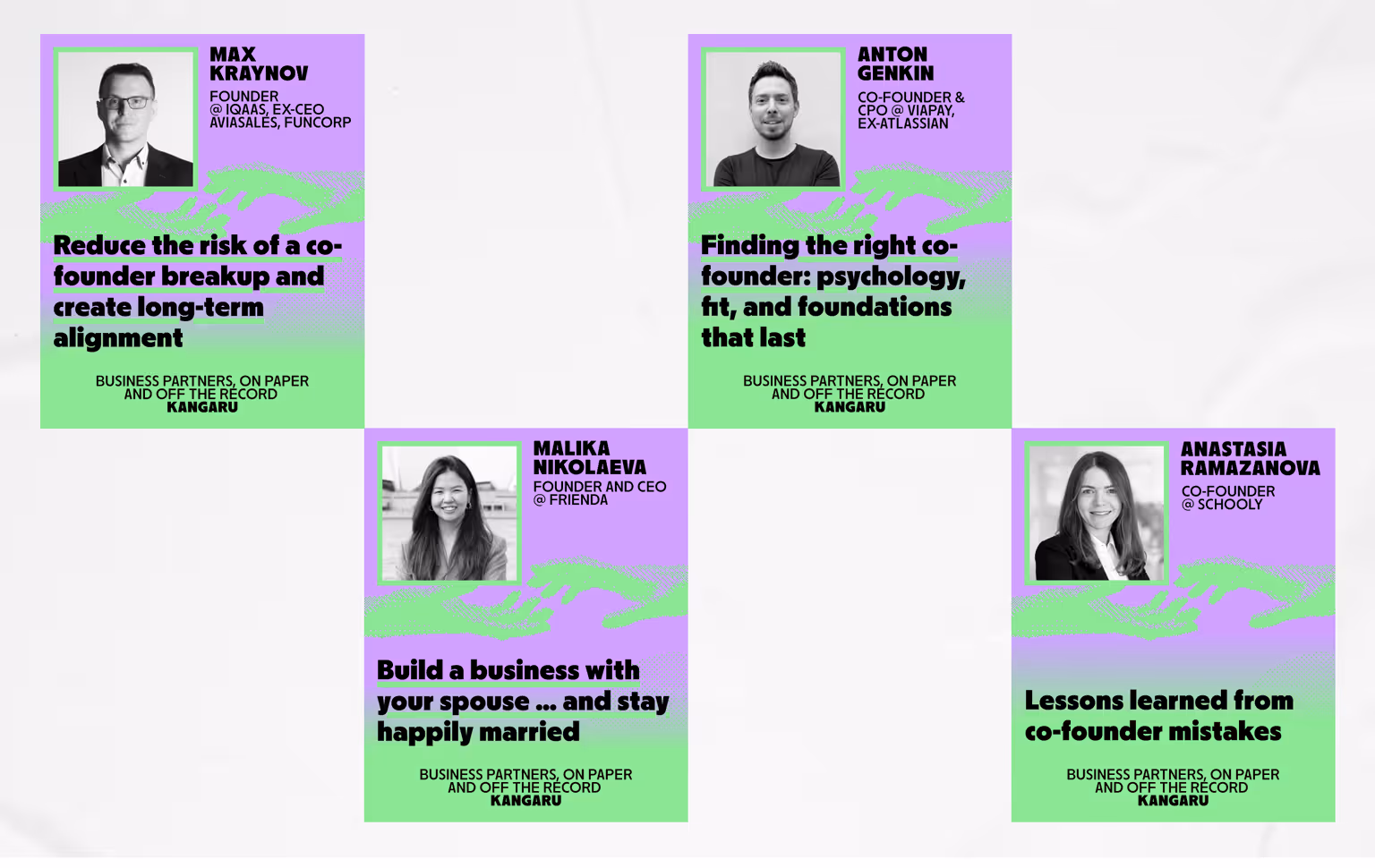
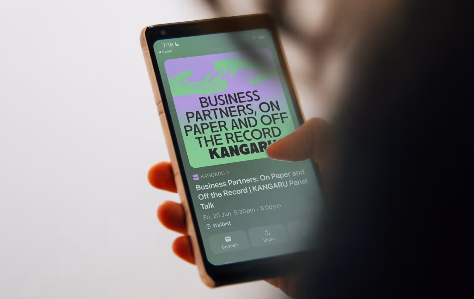
The process included brand platform, values, tone, positioning, visual direction, and communication logic. We also considered how the identity would work across meetups, speaker events, social media, partner communication, founder introductions, and future community formats.
Result
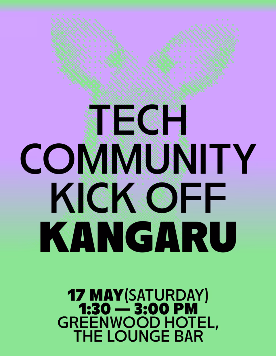
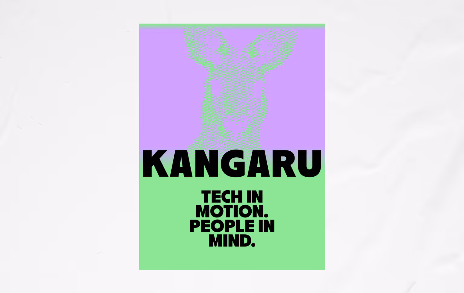
KANGARU left the project with a bold and flexible identity system for a Russian-speaking startup and IT community in Australia.
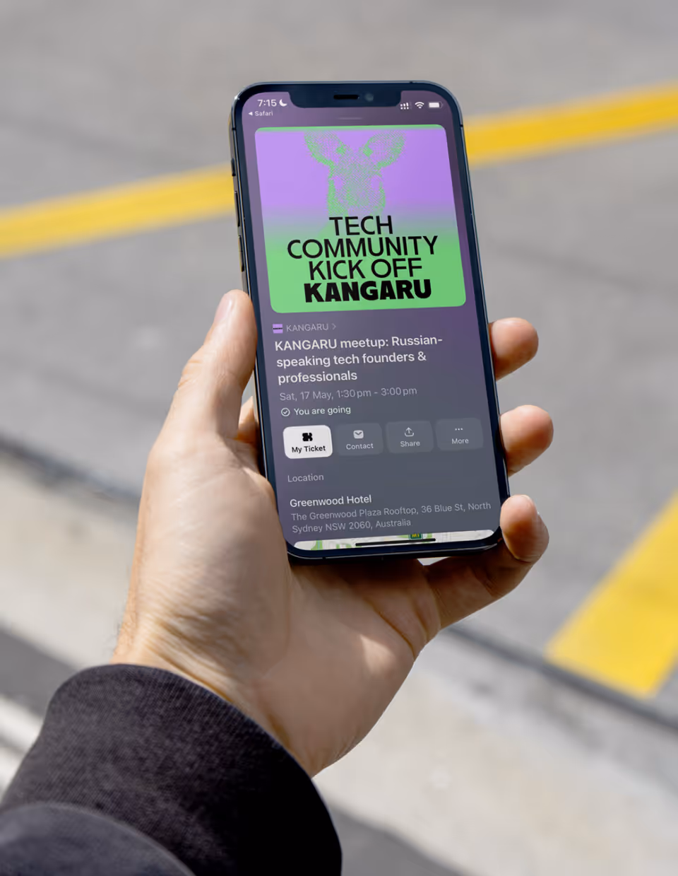
The brand foundation aligned the founders, advisor, working group, and active participants around one shared direction. The identity now gives KANGARU a recognisable structure for events, social media, speaker materials, partner communication, and future community growth.
What changed
• Three founders, a strategic advisor, a volunteer working group, and active community members were aligned under one brand foundation.
• KANGARU gained a clear identity for a Russian-speaking startup and IT community in Australia.
• The brand platform clarified values, tone, positioning, and communication direction.
• The visual identity was designed to reflect startup energy, cultural connection, openness, and ambition.
• Events, social media, speaker materials, partner communication, and community content now follow one shared brand logic.

.svg)

.webp)


.svg)